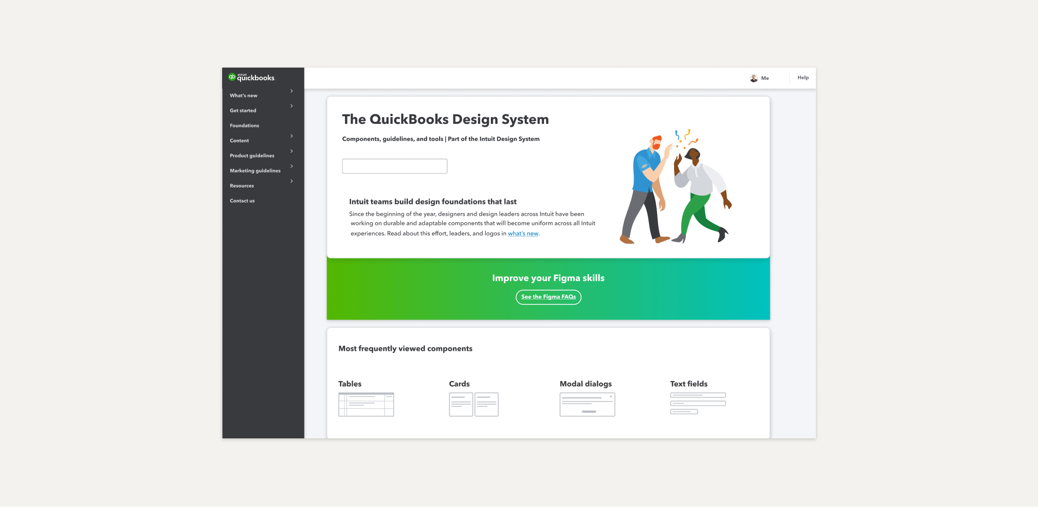
We’ve made the bittersweet decision to retire the QBDS site. You can still find its contents archived in an Intuit Figma workspace. Anyone who works at Intuit can access it.
We’ve moved!

JingBot in #ask-ids-qb
If you need to find quick links to Figma assets, documentation, or Storybook link to QuickBooks web component.
Intuit Design System
A Figma plugin to help you find Figma asset, documentation, or Storybook link to all BU’s component.
Learn more

Product playground
Our beloved place that fuels and fosters our employees’ customer obsession!
Explore Intuit products
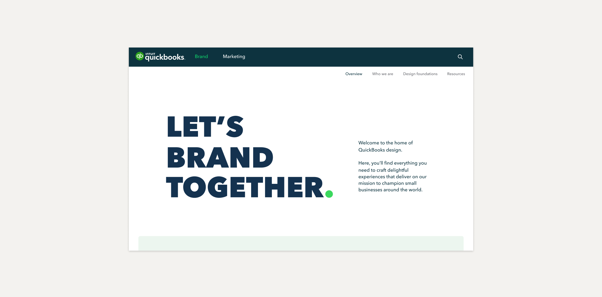
Looking for Brand and Marketing?
We have a new home! Visit design.intuit.com/quickbooks to get inspired.